Gap Logo Change Creates Buzz
By Tias, Gaea News NetworkFriday, October 8, 2010
SAN FRANCISCO (GaeaTimes.com)- Gap has a new logo and the people do not seem to like it. The 41 year old clothing company received a barrage of feedbacks after changing the design of the logo. The company released a statement urging the patrons to come up with their own logo designs and thanked them for the response to the new logo.
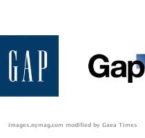
The new Gap logo has created a huge buzz on the web and the official website of the company has already implemented the logo. Considering that the company has been using the same logo for over 20 years, the statement by the company made it evident that the original Gap logo is gone for good. The original Gap logo had the letter GAP written in the middle of a blue box. The new logo is lightly more complex and only the first letter of Gap is in caps. The blue square which was in the background has been reduced in size and placed over the ‘p’. A bit of the square is seen overlapping with the upper part of the last letter.
In the statement, that Gap released after the new logo received a lot of criticism, the company said that they are looking for new designs and is open to the idea of the public sending them their own designs. The web on the other hand is abuzz with the blogs and reactions of the Gap wearers who find the new logo boring and want their old Gap logo back. Some experts say that the crowd sourcing initiative taken the company could be highly beneficial for the business.